Image
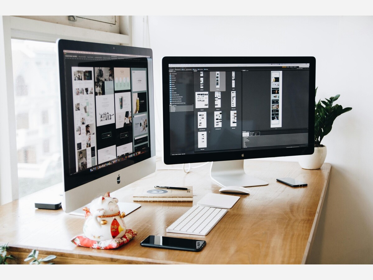
Image via Pexels
by Erin Reynolds
Your portfolio isn’t a placeholder—it’s the main event. When people find you online, it’s often the first thing they see, the first thing they judge, and the only thing they remember. So why does building a strong one still feel like a chore no one teaches? Whether you’re a designer, illustrator, copywriter, or hybrid of all three, your portfolio shouldn’t just “exist”—it should communicate, connect, and convert. Here’s how to make that happen without the fluff, the formulas, or the funnel talk.
Your portfolio isn't just a collection of work—it's the story of who you are through what you've made. Framing each project with a bit of narrative—what the goal was, why you approached it the way you did, what the result taught you—helps clarify how your skills and personality tell a story. You’re not just saying “I can design” or “I can shoot video.” You’re saying: “This is the type of work I care about, this is the way I solve problems, this is the energy I bring into the room.” A static gallery can’t do that on its own. You need to build rhythm between your projects and the way you present them.
If your instinct is to upload everything, pause. The portfolios that resonate most make space for your strongest pieces and nothing else. More isn’t better. Choose only the work that represents what you want more of—and be ruthless about it. Think like a filmmaker cutting a reel: trim to the core. People remember peaks, not piles. Let strong projects shine by cutting what muddies the signal.
Presentation matters—but so does format. One simple way to stay professional is by using tools that provide ways to change a PNG to PDF, especially when uploading to submission platforms or sending sample decks. Don’t assume your file looks good everywhere. Your visuals should be crisp, your layout should hold across devices, and nothing should feel slapped together. It’s a small move with big consequences.
You have options—don’t sleepwalk into a default. Many creatives miss the nuance of selecting portfolio builders designed for creative visual work, each with strengths and trade-offs. Some give you full control, others offer templates that remove the guesswork. What matters is alignment with your goals: a clean gallery, a media-rich showcase, or something in between. Pick something you're proud to update. If it feels like a chore, it’ll fall behind.
Even the best visuals can fall flat without some background. Give each piece a brief rationale—something that lets the viewer understand the context that makes the work resonate. A poster might look cool, but was it part of a campaign? What was the problem you were solving? Were you working solo, collaborating, learning new tools? Make it clear what mattered. Without it, you’re just posting pictures.
You don’t need an ad budget. But you do need amplification—and that starts when you tap into your creative referral network. Post new work. Tag collaborators. Share behind-the-scenes process. Testimonials help too, especially from past clients or creative leads. It’s not bragging; it’s awareness. People don’t always remember your name, but they’ll click if someone they trust is involved.
The best portfolios feel alive. That energy builds when there’s evidence of thoughtful curation over time builds lasting relevance. Update quarterly, if not monthly. Archive work that no longer fits. Add pieces that reflect who you are now, not just who you were. Even small tweaks—a rewritten blurb, a reordered sequence—can show momentum. Don’t treat your portfolio like a time capsule. Treat it like a conversation.
Your portfolio isn’t a storage locker—it’s a signal. It tells the world where you’ve been, what you care about, and what you’re available for next. It doesn’t have to be perfect, but it does have to be intentional. Every piece, every word, every frame should answer the question: “Why am I showing you this?” If you can’t answer that—cut it. If you can—lean in. Because clarity doesn’t just get noticed. It gets remembered.
*Erin Reynolds is the creator of DIYMama.net, which provides resources to help others with home improvement projects and repairs. Keep an eye out for the DIY or Not Calculator, which will help you determine whether or not to take on a project yourself!

Moderate rain, with a high of 94 and low of 62 degrees. Sunny during the morning, clear overnight.